Welcome

A free creative resource for designers, decorators & interior painters.

If you are new to this Paint Some Colour blog then welcome. We have readers from around globe; from Australia to India, Japan and the U.S.A, as well as here at home in the U.K.

I've worked in the design industry for well over 25 years & my approach to colour selection is practical, creative and systematic.
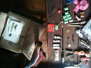
My personal way of choosing colour is based on an analytical engagement with the subject and the creation of a visual story, supported by a unique library of images and materials collected over the years.

The last place I look to find the colour of my dreams is on a paint chart. It's not that I never go there, I do. It's just that the manufacturers paint chart is the final tool in the decision making process. I use them only to qualify my choices.

I'm also deeply interested in the historical evolution and the manufacturing of paint; its application and range of finish, from dead matt through to ultra gloss. The way light plays on a decorated surface, is as important as the very colour itself.

I work my craft professionally with PLAIN ENGLISH & BRITISH STANDARD CUPBOARD MAKERS
Showrooms in Hoxton Square, Marylebone London and Suffolk. England.

I also offer a COLOUR CONSULTANCY sevice

Please feel free to ask me about colour, paint, materials or decorating.

Other than that, please enjoy.


Mark


Friday 20 May 2011

Colour choice

In the right light, at the right time, everything is extraordinary.  
~Aaron Rose
I've seen the light....

I'm often shown a paint chart, followed by "What do you think of this one" as someone points out one of the many shades, colours or hues on a card. 

Often I think it's fine, as a colour goes. But where that colour or shade works best in a decoration scheme is not so obvious.

Choosing a colour or a shaded down version near to white isn't exactly rocket science, but it does help if you have a handle on the science part, as it can be very helpful for making a colour choice work in a space.

As we know, a south facing room with decent sized windows will be bathed in warm morning light on a good day. Conversely, even on a good day a northern facing room is less illuminated and warm, why is that ? Of course it's the light but it's also the shape of that light and the direction it comes from that makes a difference.

The radiation from the sun; part of which we see as light, travels in waves. And it's the shape of the waves that determines how we see colour. Red/orange at the beginning of the spectrum has the longest wave length and blue/violet at the other end has the shortest.

The light in the early part of the day is warmer in colour due to our proximity to the sun producing the red orange and yellow colours of the spectrum . During the later part of the day as the sun is further away, the cooler colours of the spectrum, blue, green, indigo and violet become more apparent.

But how does all this relate to the colours we choose to paint our rooms and spaces?

As an example; if you painted two rooms with opposing north-south aspects in the exact same blue colour, the room that faced north would appear a more intense version of that blue. But why ?
Simply because when the sun light eventually comes round to the northerly aspect it would be in the short wave form due to the distance at that point in the day. The short wave form is the cooler blue part of the spectrum, so adding more blue light to an already blue room, thus making the colour grow as it were.

In other words the nearer the sun the warmer the colour range, the further the sun the cooler the colour range. * However, to put this into perspective. The wavelengths of visible light to the human eye lie between 400-700 nanometers. A nanometer (nm) = 1 billionth of a meter, which is the standard measurement used to express wavelength.


So, surely if you choose a light shade of near white it will be fine. Well firstly, all the shades of near white are really pared back colours all of their own. They play with the light in the same way albeit more subtly. There is a trend for muted greys and off whites for interior schemes. These are produced by mixing a range of high quality pigment colours and this is where the detail is important.

In classical colour mixing it is possible to blend a combination of tonal and complimentary colours to produce one final colour like French Gray. Now to achieve a grey colour you mix red and its spectrum opposite olive green. This into a white base with the addition of yellow ochre and lamp black produces a classic decorators colour French Gray.

So, when this grey colour is used in a room it will appear to change its tone and intensity depending on the light conditions. In the morning sun light it will show its greyness more apparently due to the red light wave in the light neutralising some pigments in the paint. But as the day goes on the room will appear more grey-green or grey-mauve  as the lightwaves change to draw the pigment in the paint colour. By dusk the whole room will have achieved a deeper shade of the cooler colour range in the spectrum, it will in the shadows take on a whole grey-geen or cool grey mauve tone of the final colour. All very calming and restful, all very encapsulating as a colour to live with.

The real deciding factor then is not the room or the colour, it's the light that shines through. It's what makes the real difference in the end.

Mark


Friday 6 May 2011

The Recycled House.

Artists' Open House - Dulwich Festival 2011

I wholly recommend you take the time to visit to this living art piece. It is first and foremost a real home. It is also a living & ever changing installation piece. Conceived by the creative pair of Mark Hill & Kate Shipp.

The Dulwich Festival gives us a rare opportunity to see this both amusing & captivating space. Imagine a house decorated by Sir John Soane but sourced by Albert Steptoe. The interior is full of items saved literally from skips & scoured at boot sales. Items swapped, traded and made from up-cycled scrap, things that most of us would overlook.

It's also quite beautiful, almost museum like, though not overly precious. It is after all a family home for the couple & their two children.

They themselves describe the house as
"illustrating the possibility of living elegantly whilst reducing the environmental impact"
I think it forces you look at things in a new light too, it is a mirror of how disposable we've become as a society. It pulls you up, it makes you think. I know I feel better for it.

In the photo, Kate Shipp & Mark Hill
I've personally been to the house a number of times and each time I discover a new part I'd overlooked before. Though it may well have never been there in the first place, in all it gives you a heady flood of images and objects to view; be warned though, this is no trip to Ikea.

Also much of what you see is for sale. Mark is a working artist & trader, so don't be surprised to find price tags on your tea cups or cake stands. Also ask to see his other work too; it's all there on the walls, with much more hidden in the plan chests.

Of course all this looking can be both exciting and exhausting. So, to revive your spirits Kate & Mark set up shop in the garden, serving tea & home-baked cakes on alice-in-wonderland style cake stands ( yes,  Kate & Mark make and sell these too )
All this reviving refreshment served in the tranquility of the garden, gets you ready for another look at this truly unique house.

Lastly, there is a little Pop-Up market to feast your eyes on. Bring some cash or a cheque book as this The Recycled House is a gem of a visit.

Open on 7-8th May and the 14-15th May

11:30-5pm
No need to book


The house is at
4 Longton Avenue SE26 *click on for a map near to the beautiful Sydenham Wells park

It's easy to get to by car, bus or train  * see links

By train, head for Sydenham in SE26 on the fantastic new overground Train Service and it's about a 10 minute walk from the station.
Buses from Crystal Palace run every 10 minutes.

Contact details

shipp.hill@virgin.net
www.therecycledhouse.co.uk

And, maybe I'll see you there....


Mark
x

Tuesday 3 May 2011

It's Only Paint.

The same but different...

The manufacture of paint is big business. However, this big business is being pushed in a new direction. Millions of litres are made & sold each year and essentially the principle stays the same. A tin full of a beautiful coloured liquid, applied with a brush or roller to create the desired decorative effect. What could be simpler & why change a winning formula ?

Faded mid-century sign in SE22
  
Well essentially nothing has changed, paint is hundreds if not thousands of years old. The principle application is the same and the make up and composition of paint has always evolved. But, we are now going through one of the biggest shifts in the technology and chemistry of paint seen for years; why is that ?

Well, not surprisingly, it turns out that much of the oil based paint we used in the past was in some way or another toxic; it gave off too many nasty fumes and the E.U rightly, in this case, stepped in. New regulations and compliances for V.O.C's were drawn up and their implementation started in 2010.

So, how did this affect us, the end user ? Surely, as it is now healthier to work with, everyone must be happy. Well, yes and no. 
See, some people hate change, not everyone, but some. It's made worse if it's forced on you, even worse if it costs more in time and money.

I'll give you an example: 
The old style oil based-eggshell ( whose smell did knock your head off somewhat ) allowed you to coat the job in hand on day one; next day, a light rub down with flour paper and it was ready to re-coat again. Simple, no messing around. The fumes however, were another thing.

The new 2010 regulation oil based-eggshell still allows you to coat on day one. However, some can require 16 hours between coats. When you do re-coat it even after that time it's still very soft, better if left for 24 hrs plus. That means many jobs aren't re-coated the next day and as we know time is money. It is also more of a challenge to apply; some do dry shinier too, though that does seem to die back after a while. So, as you might guess, not everyone likes it but it is far less odorous to work with.

During the reformulation process some manufacturers did a better job than others. My personal favourite Oil-Based if I do have to use oil is the Little Green Oil based eggshell. It has been reformulated with sustainable vegetable oils, cutting down on V.o.c's and odour. It brushes out well and dries back beautifully flat when cut or thinned with pure turpentine rather than the harsher white spirit. It is still challenging to use, but then again, the water based eggshells are so nice to brush out, maybe i've gone & spoilt myself.

Now, as the regulatory changes occurred it allowed other paints based on aqueous solvent to come to the fore. Farrow & Ball took the biggest step by dropping oil based completely, they now only retail water based eco paints. The brand has grown all the stronger for it. It's become the benchmark for the boutique paint market.

The real plus is; these paints are water based, dry much faster and are virtually odour free. Though not totally new, they are now way better formulated than anything else before them.
All this is a great, but they can require more coats and regular brush rinsing in water however, that given, I really do prefer them. I now use more acrylic eggshell like  Farrow & Ball's eco, Little Green, and Siecle's Pure Acrylic in my work and teaching than any oil paint, by a large margin.

Lastly, I photographed this faded sign in SE22 the other day. I reckon it dates from the around 1950's and "spell" like, it magically reads:

"Noted ****. Genuine Turpentine. Linseed Oil. Boiled Oil . White Lead Colours etc. Ready mixed paints."

It really does make me smile. I see painting as part chemistry, part alchemy. There is a kind of magic when a new colour goes on; it's transformative power still has a hold on me, that much I do know, however formulated.

Mark